Accessibility Fundamentals
Web accessibility allows people with disabilities to consume, understand, navigate and contribute to the Web. There are a number of disabilities which will affect Web access, such as visual, auditory, physical, speech, cognitive and neurological disabilities. Consider some of the following examples:
- A user is using a screen reader due to a visual impairment; how does their screen reader relay the contents of a website to them in a sensibly structured manner?
- A user is unable to use a mouse due to a motor disability; are they able to navigate through a website using a keyboard?
For a more in-depth look at the diversity of Web users, check out the Web Accessibility Initiative.
Why is web accessibility important?
As a society, we are becoming increasingly reliant on the Web. This has made its way into many essential parts of life: education, government, health care and many more. To give everyone the same opportunities, it is crucial that websites are accessible to all. It can be easy to forget this when developing a website.
However, we can take this idea even further – for many people with disabilities, an accessible Web can offer access to information and interactions that would have been impossible to get through traditional methods (books, radio, newspapers etc.).
Alongside this inclusivity, there are other benefits of Web accessibility, including:
- SEO (search engine optimisation): Search engines will access your website in a similar way to a visually impaired user. By improving your website for one, you will be improving it for the other!
- Reputation: demonstrating social responsibility will help build public relations and users will be more likely to recommend your site
- Usability for all users: While working on the accessibility of your site, it is likely that you will discover other usability issues with your website that would affect all users
Just like usability, accessibility is built into the design of the website, and should be kept in mind throughout the design and development process. It’s much more difficult to fix accessibility issues in an existing site.
Your future clients may require you to meet the WCAG 2.0 Accessibility Guidelines. Three levels of conformance are defined – A, AA or AAA. These are good guidelines to follow, but it’s important not to treat accessibility as a box-ticking exercise!
Different types of users to consider
Here are some aspects you should consider when designing and building your site, to make it usable and user-friendly to as many people as possible. (Note: it’s not intended to be an exhaustive list.)
Colour-blindness
A colour blind user may be using your site without any special tools, but may struggle to distinguish between many different colours.
This is particularly important for applications with extensive images, charts, colour-pickers etc. Ensure that any colour-sensitive images or elements include a label:
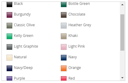
Without labels, this selector for a T-Shirt colour would be nearly unusable for a user with Protanopia:
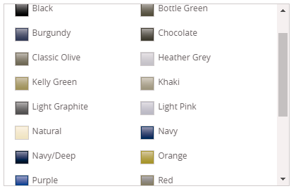
The above was generated using a tool to simulate what different forms of colour-blindness might look like.
Partial blindness
Partially sighted users may still be able to use a site without a screen reader, but may require increased font sizes and contrast.
Many users that are not necessarily considered disabled can be included here – there are rapidly more and more aging internet users, who often have mildly impaired eyesight.
Typical guidelines suggest that all fonts should have at least 4.5:1 contrast ratio as judged by the Snook colour contrast checker. The default font size should be reasonable (11-12px), and all content should still be visible and usable when re-sized by a browser (e.g. 200%).
Complete blindness
Some users will be using a screen reader. The screen reader works its way through the HTML on your page and reads the text aloud. You can try one out in the second exercise.
When it comes to an image, it will instead read the alt attribute of the <img> element. This is where we can put some information about the image for the screen reader.
<video> elements have a similar aria-label (more on ARIA later). However, it is going to be most beneficial if a transcript of the video is included on the page. There are many tools out there for generating such transcripts.
Deafness
On a similar note, if a person is deaf, they will be benefit greatly from a transcript of a video. If possible, subtitles or signing on the video would be ideal.
Physical impairment
Many users with a physical impairment will be using only a keyboard, or onscreen keyboard.
Therefore all controls should be usable with the the keyboard: the user should be able to reach all clickable elements using the keyboard, and the order in which elements are focused should make sense. Particular areas to check include menus, forms and video controls.
Cognitive impairment and other disabilities
Good UX principles are particularly helpful for users with cognitive conditions such as autism and dyslexia. For example:
- Improving readability, and writing in plain English
- Keeping content simple and clear
- Unambiguous calls-to-action
These things should not detract from the design of your site, on the contrary: all your users will benefit from an easy-to-use site.
Situational and temporary disabilities
Accessible design isn’t just about people with permanent health conditions. Lots of people can find it difficult to use the web temporarily or in certain situations. For example, some people only have one arm, but others might temporarily have a broken arm, or be a new parent and be carrying a baby in one arm while trying to use your site on their laptop. (See Microsoft’s inclusive design manual in the links below.)
Accessible HTML/CSS
The most important principle is to use semantic HTML–markup that describes what your content means, not what it looks like.
You can use CSS to make any element look like any other, but a screen reader won’t be able to follow that. Instead, you should use appropriate elements for the task at hand:
- Links should use an
<a>– any component that takes you to another location when clicked - Buttons should use a
<button>– any component that performs an action when clicked - Use headings (
<h1>,<h2>etc.) in the correct order, without skipping levels, and don’t use them as a shortcut for styling text that isn’t a heading - Split paragraphs with
<p>rather than<br> - etc.
Similarly, structure your HTML as you would like your page to be read. You can use CSS to arrange elements however you like, but a screen reader will (mostly) just run down in the HTML order.
Nest your elements into sensible chunks, ideally with their own headings, so a screen reader user can jump to sections without needing to work through the entire page.
Other more specific rules for text and media content have already been mentioned above.
Accessible Javascript
Using Javascript in the wrong way can severely harm accessibility.
But Javascript can often greatly enhance UX, so it’s not necessary to cut it out completely from your site – you’d make the site less easy to use for many users.
Instead, Javascript can and should be written accessibly.
Here are some good practices when thinking about Accessible Javascript:
- Use the right element for the job – e.g.,
<button>for any clickable element performing an action - Make sure you can use the site using just the keyboard – e.g., implement keyboard triggers as well as mouse-specific triggers for events, like on-focus as well as on-mouse-over
- Don’t alter or disable normal functionality of a browser
- If you trigger events, make sure users notice – e.g., by announcing the change on a screen reader
- Don’t rely on Javascript to generate necessary HTML and CSS
In general, use JavaScript to enhance normal functionality, rather than make large changes or build the entire page structure.
For example, using JS to validate a form client-side will help users with JS fill out the form more easily, but won’t affect non-JS users at all.
No Javascript
Many users don’t have Javascript at all, or have good reasons to turn it off, e.g. users with old browsers and computers, slow internet connections, or strict security restrictions.
To make your website accessible to these people too, your website should be usable without Javascript, even if the user experience isn’t as good.
Display clear alternatives for things that don’t work without Javascript, and avoid confusing or non-functional content.
ARIA – Accessible Rich Internet Applications
ARIA is a set of HTML attributes that are specially designed to make web content (particularly rich content) accessible.
There are a large number of these and it may not be practical to implement all of them in every case. However, any additional effort will go a long way for the increasing number of screen reader users.
ARIA tries to fill in some gaps in semantic HTML, where the HTML element alone may not be enough to describe its use.
Some examples:
- The main content element should be marked
role="main", allowing screen-readers to jump directly to it role="presentation"for elements that are used for display purposes only (and have no semantic meaning)aria-hidden="true"for elements that are hidden using JavaScript or CSS, so should be ignored
Further reading
- A series of interviews with people with disabilities
- A set of posters with guidelines for designing for disabilities
- WCAG 2.0 Accessibility Cheatsheet
- Inclusive Design at Microsoft and their inclusive design manual
- Semantic HTML tutorial
- Writing JavaScript with accessibility in mind
Responsive and Mobile Design
What is Responsive Design?
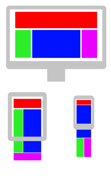
Responsive Design refers to the practice of designing web pages to be rendered well on a variety of devices, with several different window and screen sizes.
This is mostly a case of arranging content so it can adapt to the different screen shapes and sizes. As an example:
Mobile Browsers
Mobile browsing makes up around half of all internet traffic, so almost any website you make should be responsive enough to work on a mobile browser.
There are several big differences between a mobile and desktop browser. The main ones being:
Screens
The most obvious; mobile devices are much (physically) smaller than a desktop screen. This means you simply can’t fit as much information on the screen at once.
Avoiding content clutter is very important for usability, so we need to be much more careful with how content is laid out.
Users are used to scrolling up and down, but left/right scrolling and zooming are much less comfortable. Combined with the typical portrait orientation of a mobile device, wide content should be avoided.
Instead, most content is arranged in a tall column, with a decent font size and a simple layout.
Touch Input
If your site features a lot of buttons and interactivity, touch inputs have a few crucial differences:
No Hovering
You can’t hover over elements, so any CSS effects or JavaScript event listeners will not work. Instead you will need an alternative approach that can use taps.
(Note that having a replacement for hover event listeners is also crucial for accessibility!)
Poor Precision
Especially with the lack of hover effects, it can be quite hard to tap precisely with a fat finger! Make sure all clickable links & buttons are nice and big, so there’s no risk of missing.
Swiping
One benefit over desktop devices is the possibility of gestures like swiping left/right. These should not be overused, but applied correctly they can add an extra ‘native’ feel to your site.
There is not much built-in support for this, but there are plenty of libraries. For example, jQuery mobile has swipeLeft and swipeRight events.
Awkward Keyboards
On-screen keyboards are tricky to use and take up even more valuable screen space.
Avoid text inputs if possible, and if necessary make sure any important information can fit into the small amount of space remaining.
Bandwidth
When on 3G (and even 4G), download speeds are significantly lower than broadband internet. More importantly, most mobile plans strictly limit the amount of data that you can use. If users find that your site eats up a big chunk of their data, they are unlikely to come back!
Consider reducing the quantity and size of images, minifying JavaScript and CSS, and avoid autoplaying videos.
General Tips
To allow your page to adapt to a continuous range of screen sizes, there are a few general tips to follow:
Use relative units: Instead of fixing the size of elements with precise pixel measurements, use percentages. Instead of setting margins with pixel measurements, try using em or rem.
Set a max/min-widths for your content: Content wider than about 70 characters is significantly harder to read, so try setting a max-width on your main content. At the other end, a min-width can prevent elements from shrinking into nothingness on a small screen.
Use flexible layouts: Allow elements and text to wrap where it makes sense to do so. In particular, flexbox will arrange and wrap items according to the specified rules (see Further Reading).
In combination, these strategies will enormously help your site feel responsive rather than being rigidly fixed into place.
Have a look at this simple Demo (try dragging the bottom-right corner to resize the container).
Media Queries
If you can arrange your CSS to look good on any viewport size, excellent work!
Most of the time you will need to make more significant styling changes under certain conditions. For example: re-flowing content, changing font sizes etc.
Fortunately CSS provides a way of specifying that different rules should apply on different displays, by using @media queries:
@media (query) {
  /* rules here */
}
There are a lot of possible queries, but the most useful are likely to be:
min-width: <width>– display width greater than the specified widthmax-width: <width>– display width less than the specified widthmin-height: <height>– display height greater than the specified heightmax-height: <height>– display height less than the specified heightorientation=portrait– display height is greater than widthorientation=landscape– display width is greater than height
(Note that all the queries are inclusive, so min-width: 600px will match a 600px display).
For example:
@media (max-width: 700px) {
  .container {
    flex-direction: column;
  }

  /* other rules for small screens */
}
The queries can be combined with and, not and commas:
@media (min-width: 701px) and (max-width: 1100px) {
  /* rules for medium screens */
}
There are other types of query, see Using media queries, but they are not often used.
SASS
SASS can put variables into a query, or even replace the entire query section:
$breakpoint: 600px;

@media (max-width: $breakpoint) {
  // rules
}

$desktop: "(min-width: 1008px)";

@media #{$desktop} {
  // rules
}

// They can also be nested, just like any other rule:

.widget {
  // General rules

  @media #{$desktop} {
    // Desktop-only rules
  }
}
This allows you to keep your different media rules for each element close together.
Breakpoints
Defining media queries on an ad-hoc basis can lead to very confusing and disorganised CSS. The usual response to this is to define a set of breakpoints.
These are specific widths where the style changes. Visit the BBC website and try slowly reducing the width of your browser. You should notice that there are a few points where the style changes abruptly.
For example, at time of writing the nav-bar has 2 breakpoints at 1008px and 600px. This gives 3 distinct styles:
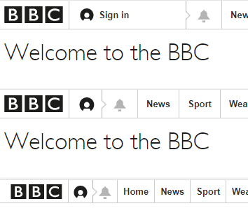
The main content will also change layout, pushing content into a thinner, columnar design.
Choosing breakpoints
It can be tempting to set breakpoints to target specific devices, but the best way to future-proof your breakpoints is to place as few as possible and only where they are needed!
A simple way of doing this is ‘mobile-first’ development:
Implement your site as you want it to be seen on the smallest devices first. Once you are happy with it, increase the size of the screen until you think it no longer looks acceptable–this is the place to add a new breakpoint.
Repeat this process until it looks good on the largest screen size and you will end up with a minimal number of breakpoints and a site that looks good at all sizes.
Focusing on the (often simpler) mobile design first allows you to build up complexity rather than forcing you to jam an entire desktop site onto a small screen.
Minor breakpoints
Sometimes you want small tweaks between major breakpoints–e.g. adjusting a font size or padding.
Try to keep these to a minimum, but used correctly they can add a more natural feel at intermediate widths.
Touch Events
Much of the web is not designed for touch devices. This forces most mobile browsers to emulate mouse events when performing touch actions.
For example, when tapping on a mobile browser, you typically get several events dispatched – likely touchstart, touchend, mousedown, mouseup and click (in that order).
With most controls (e.g. buttons), the best solution is just to bind to click as you usually would, and rely on the browser to dispatch the event on an appropriate tap.
Tap Delay
Most mobile browsers will pause briefly upon a tap to determine whether the user is trying to perform another gesture, this typically adds a 300ms delay before a tap is produces a click event.
There is a way of avoiding this, but it is not universally supported.
Touch-specific Logic
If you wish to use touch-specific logic (e.g. to provide behaviour that would ordinarily be invoked by hovering), you can use preventDefault to prevent mouse events, even if you have already bound a mouse event handler to the element:
var button = document.getElementById('myButton');

button.addEventListener('mousedown', function (event) {
  console.log('mousedown');
});

button.addEventListener('touchstart', function (event) {
  event.preventDefault(); // Will suppress mousedown when touched
  console.log('touchstart');
});
However this will disable all other browser features that use touch or mouse events (scrolling, zooming etc.) so is not often useful.
Instead, consider rethinking how users can interact with your component in a way that works for both mouse and touch inputs.
Further Reading
There are many other blogs and guides on web about responsive design. Here are a few specific extensions that are not covered above:
Flexbox
If you are not familiar with them, it certainly pays to get accustomed to using flexboxes. They make producing complex responsive layouts much more straightforward.
Try the MDN Basic Concepts of Flexbox guide and have a look at the Flexbox Cheatsheet.
Note that while Flexbox is supported in all modern browsers, there are several known bugs, particularly IE11.
Grid
Even more recent than flexbox, the CSS Grid Layout is another way of laying out out pages in a very regular structure. A similar Grid Guide is available.
Grid has even shakier browser support than Flexbox, this MDN Article outlines the situation.
View sizes and pixels
You may observe that mobile devices are typically listed as having view widths somewhere between 320px and 420px, but the same devices are marketed as being HD, QHD, UHD, 4K, or any number of other terms that suggest that they are thousands of pixels wide.
The secret is that the CSS px unit represents a ‘reference pixel’, which may not be exactly one device pixel.
High-DPI screens (e.g. most smartphones and ‘retina’ displays) have a device-pixel-ratio greater than one, which is used to scale each px unit.
For example, an iPhone X has a screen 1125 pixels wide and a pixel-ratio of 3, this means the “CSS width” is actually 1125 / 3 = 375px. All px units are scaled equally, so an element with width 100px will actually take up 300 physical pixels etc.
This is all completely transparent and you will very rarely need to worry about it.
Images and srcset
The main case where you might worry about high-DPI screens is with images – where you actually can use the high pixel density to display high resolution images.
The simple way to do this is simply to provide a larger image than its CSS width.
Suppose we have an image which is 900 pixels wide, but set its width as follows:
<img src="pic-large.jpg" />
img {
  width: 100%;
  max-width: 900px;
}
Consider three devices:
| Physical width | Pixel Ratio | CSS Width |
|---|---|---|
| Desktop | 1 | 1920px |
| Phone 1 | 3 | 300px |
| Phone 2 | 1 | 300px |
On Phone 1, the image will be 300px wide (CSS pixels), but the phone will actually be able to render all 900 pixels, hurrah!
Unfortunately Phone 2 has a tiny screen, and has to load the entire image, but can only render 300 pixels wide. This is going to use up a lot of their precious data for no benefit!
The solution is to use both the srcset and sizes attributes to provide appropriately sized images:
<img
  src="pic-large.jpg"
  srcset="pic-small.jpg 300w, pic-large.jpg 900w"
  sizes="(max-width: 900px) 100%, 900px"
/>
The srcset attribute lets you supply a set of alternative sizes to the image, each comma-separated value is a filename followed by the width.
Here we have two: pic-small.jpg is 300px wide, and pic-large.jpg is 900px wide.
The sizes attribute lets you tell the browser how large the image is likely to be on-screen, using media queries when there are multiple possibilities.
Here we hint that browsers up to 900px will have 100% width, and anything else will have 900px width.
The Result
The browser will first look at the sizes attribute to determine how big the image is going to be displayed, then look at the srcset to pick an appropriate image to download.
The desktop browser will see that it is going to display at 900px and therefore download the large image.
Phone 1 will see that it is going to display at 300px, but knows it has a pixel-ratio of 3, so may also download the large image.*
Phone 2 will see that it is going to display at 300px, and only needs to download the small image.
Miraculous! See the MDN Responsive Images for more detail.
* A side-benefit of srcsets is that devices can opt to download the smaller image under certain conditions, even if they could display the larger one. If you are on 3G it might pick the smaller image anyway, so it can load quickly and conserve data.